I love maps. I mean…I LOVE maps. This love of maps camp from my dad. He is a geologist, and he taught me at a very early age how to read a topographic map. I learned that when the lines are close together that means the climb will be steep. I learned to recognize the direction of stream on a map from how the contours would bend on the blue line depicting a creek. I figured out the unique shape of a saddle between two mountains. My dad taught me about the difference between true north and magnetic north, and how to adjust declination on a compass to ensure you travel in the right direction. I learned how to use a compass and map to figure out exactly where I was standing without the aid of digital technology.
At my house, there are hundreds of maps and wilderness guidebooks. I have topographic maps for about every place I have ever hiked or explored. In some cases, I have multiple, torn maps from places I have visited over the years. Often, I have marked my specific route or noted cool features like Native American ruins or fossils.
I also have “topo” maps of the various climbing routes I have done over the past 25 years. These kinds of maps outline the various features that a climber would encounter during the course of climb. These maps aren’t just for their aesthetic value; they actually prevent accidents and save lives. On many multi-pitch climbs (i.e., climbs that are longer and taller than one rope length), it can be easy to get lost on a vertical wall and find yourself in trouble.
I particularly love caving surveys. These are maps that show a vertical and horizontal cross-section of caves and, in a major cave system, can help the user not get lost. When I used to do a lot of caving in Mexico and Texas, I participated in a few surveys. It takes a lot of work and creativity to accurately map out a cave system.
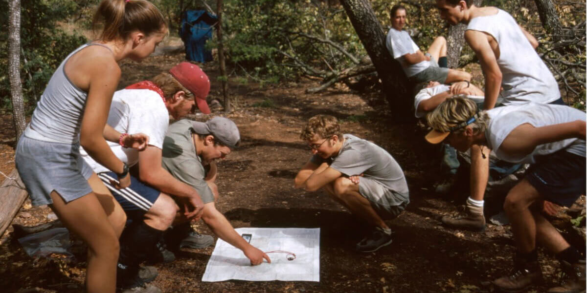
I have more than 100 guidebooks that provide descriptions of hikes, climbs, caving, and canyoneering adventures. My watch has a GPS and a map on it. In short, I love maps because they tell me where I am and where I am going.
As a historian and history teacher, maps are essential. Understanding the geography of a nation can explain much about its economy, society, culture, and politics. When studying military history, understanding the terrain is critical for scholarly analysis. When I read books, I often have my iPad open so that I can follow the narrative of events on a map. Again, I want to know where the action is/was. When I was a kid— in the era before the Internet —I would approach maps as if they were objective statements of truth. Maps in my childhood in teenage years would typically be part of an atlas or through National Geographic. These maps were produced by entities that had academic knowledge and expertise.
Over time, I became more aware of bias and how politics or a cultural perspective might influence a map. This is particularly true when one looks at historic maps of boundaries. There are some maps of the historic American West that I love because of their inaccuracies. I also like these for depictions of roads and railroads that are long gone, but would have been an essential means of travel for an earlier age. Even through I recognize how human bias can affect maps, I still tend to hope that maps represent some authentic and objective description of reality.
I read a fascinating article this week in The Washington Post about Silicon Valley’s influence on map making, and it is concerning. The title says it all: Google Redraws the Borders on Maps Depending on Who’s Looking. The article looks at how Google, Apple, and other digital map making firms will sidestep controversial issues by bending to political pressure. For instance, if you look at a digital map of the contested region of Kashmir while in India, it will show Kashmir as part of India. If you are in Pakistan and log into the same map, your view will be different and you will see Kashmir drawn very differently. The article goes on to describe other areas like Crimea, Palestine, Cyprus, and the Western Sahara were are there are territorial disputes. Users in Japan will see the tagline “The Sea of Japan”’ whereas South Korean viewers will see the “East Sea”, which appeals to their political and cultural perspective.
A danger we face as a global society is the decline in trust in expertise. A nuanced and sophisticated editorial process is essential to describing “truth.” The article notes that when print companies make maps there is a much more developed process that consults history, scholarly experts, and diplomats before they draw boundaries. Google has its own process too—as the article notes—but it is clear there are factors of which users need be aware.
Fortunately, Americans haven’t given up on paper maps. Rand McNally Atlases still sell, and I read a news report that indicates sales have actually increased despite navigation apps. I think paper maps offer a way to take in a lot more and help see bigger relationships than can be seen on a 4-inch screen. But, this week’s lesson is for us to continue to be skeptical consumers of information and not trust everything that we click, and maybe do more to rely on our own skills.