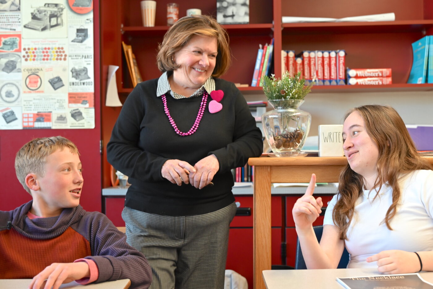
How do you get Middle School students to spend two week’s worth of English class periods—in the heart of winter—intently analyzing classic short stories by the likes of Nathaniel Hawthorne and Guy de Maupassant? Even more challenging: How do you get them to use digital tools, graphic design concepts, and artistic skills to turn that analysis into beautiful creative work?
If you are Peggy Butler, Colorado Academy’s veteran Seventh Grade English Preceptor, you enlist the help of colleagues from across school departments to turn what might have been a traditional unit of essay writing into a rich visual pilot project that engages readers through an emerging contemporary genre that’s saturating their social media feeds and buzzy creator sites such as Etsy.
A few years ago, Butler explains, she along with her fellow Middle School English teachers began reevaluating the short story curriculum that kicks off the Seventh Grade year from the perspective of diversity and inclusion—“not just among authors, but also among storylines,” she says. That led to the addition of texts by authors such as Ha Jin, a Chinese American poet and novelist, and Anton Chekhov, the 19th century Russian playwright and physician.
But how to diversify the classroom work that would surround these writers’ short stories?
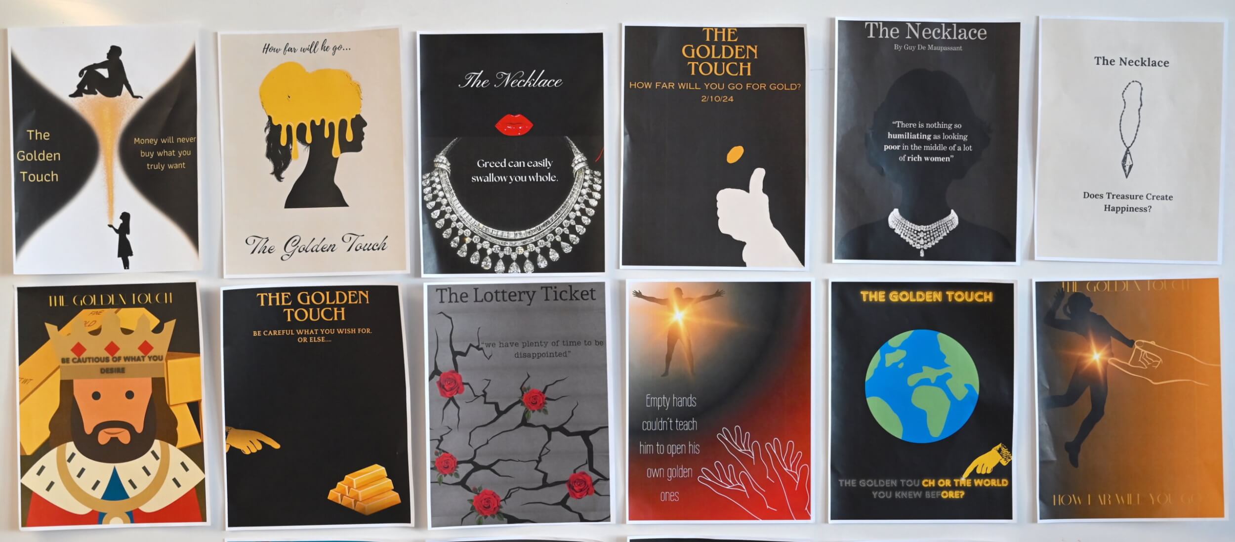
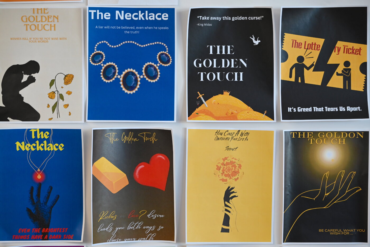
One evening, Butler was at home watching a television channel featuring film noir, the stylized Hollywood crime genre that reached its peak in the 1940s and 1950s with black-and-white classics such as The Maltese Falcon, Double Indemnity, Out of the Past, Sunset Boulevard, and The Night of the Hunter. She found herself wondering if the films’ stark, sensationalized style could somehow form the basis for her students’ analysis of the themes of greed and envy found in stories including “The Necklace,” by de Maupassant; “The Lottery Ticket,” by Chekhov; “The Golden Touch,” by Hawthorne; and “The Richest Man,” by Jin.
Butler took her notion to Director of Educational Technology Laura Farmer and Educational Technology Coach Meghan Campagna and, with Upper School studio art teacher Stashia Taylor serving as creative consultant, together they developed a project idea built around minimalist movie posters, an art style popular among young, digital-age creators nostalgic for the look and feel of bygone mid-century culture.
According to Campagna, in addition to her “day job” teaching students and teachers about technology, “I love working on my own graphic design projects, and I realized that the minimalist movie poster genre could offer a great way to integrate technology with the outcome Peggy was looking for: a polished finished product that combines a few simple elements in a demonstration of learning.”
Campagna and Farmer recommended the online application Canva as the ideal tech medium for the poster project. A popular creative suite that’s free for educational institutions, Canva allows anyone to create professional-quality designs by dragging and dropping images, text, art, and even AI-generated assets into one of many available templates. Creators can then edit, share, publish, and print their work.
Collaborating with Taylor and Middle School librarian Mary Leyva, Campagna helped put together a series of mini-lessons covering everything from the use of taglines in marketing to the history of movie posters, color theory, and the concept of visual hierarchy. She then introduced Seventh Graders to various ways they could use Canva to communicate their understanding of a short story in a design that drew on everything they had learned.
“I was so excited to have a guest teacher come to my room every day,” recounts Butler. “It was just as new to me as it was to the students—I had no idea what a tagline was before this project. But seeing colleagues find time in their schedules to come and work with me and my students was exhilarating; it’s the kind of thing we love to do at CA.”
‘Eliminating the Fluff’
The forced economy of the minimalist movie poster genre—students were allowed to use just a handful of words, an image or two, and background colors to assemble their design—turned out to be right in line with the rules Butler has taught her Seventh Grade writers for decades.
“In any piece of writing,” she explains, “we talk about opening with a hook—how do you grab the reader? We talk about eliminating the fluff and getting right to the point.”
Most importantly, Butler goes on, Seventh Graders learn the importance of editing their work, removing unnecessary words and phrases to produce writing that is crisp and clear. “It’s almost a completely new skill for them. Students come to us from CA’s Lower School being able to write and write and write—that’s what they were always encouraged to do, and we love that. But here, they’re learning how to say more with less.”
As Campagna elaborates, minimalist movie posters drive home the point that conveying ideas concisely and with impact is essential in writing, design—and life.
“We want students who are growing more sophisticated in their work to realize that as they go through their education and into their professional careers, even the best ideas can fail without the right words and visuals to convey them.” All the explaining in the world, in other words, can’t substitute for the power of a compelling presentation.
Indeed, the Seventh Graders’ final posters offer a lesson in reducing communication to its essentials.
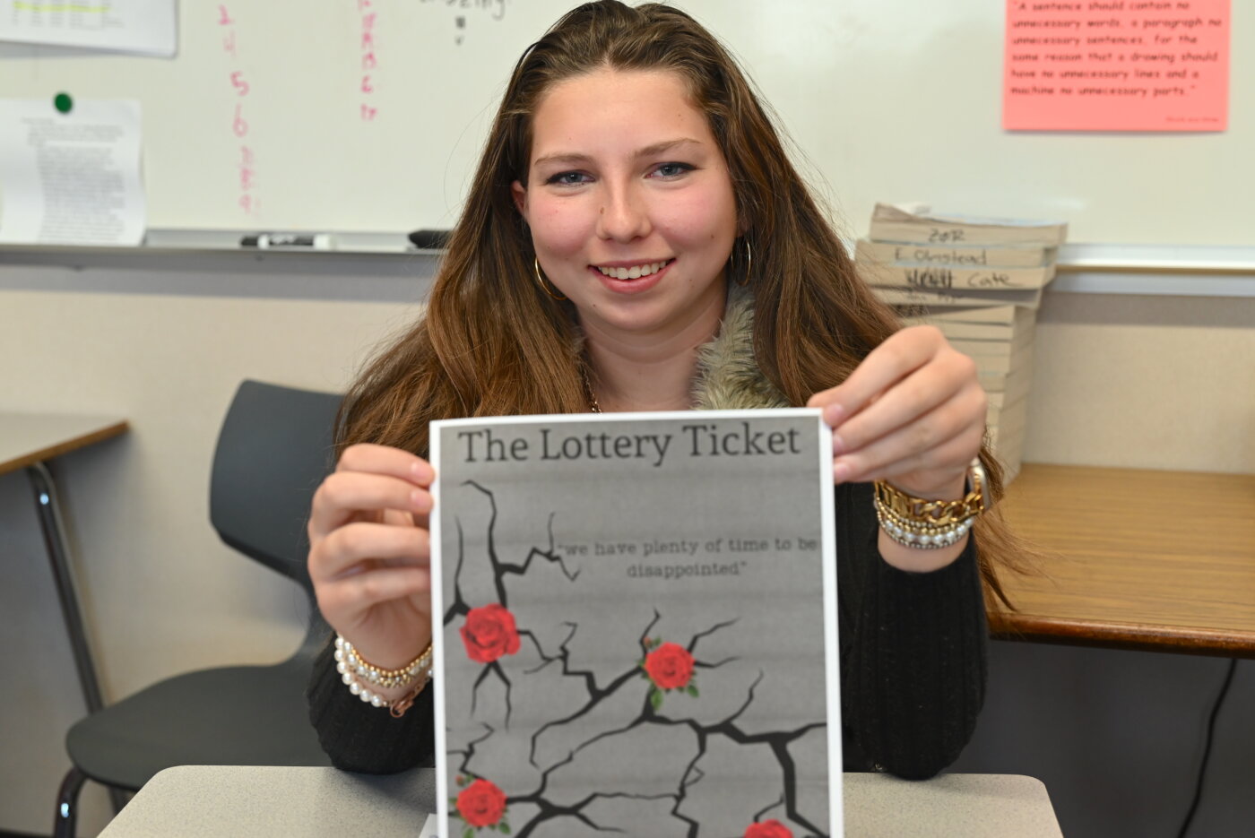
In “The Lottery Ticket,” published in 1887, Chekhov tells the story of a husband and wife who, mistakenly believing they hold a winning number, fantasize about how they’ll spend their riches before descending into greed, hostility, and anger. Layla Zisler’s minimalist movie poster for the work features the memorable line, “We have plenty of time to be disappointed,” accompanied by roses emerging from fractured concrete. “The quote just stood out to me because it’s kind of mysterious, but it also tells you what their life is like without even knowing the story,” she points out. “I wanted to make the viewer want to read it.”
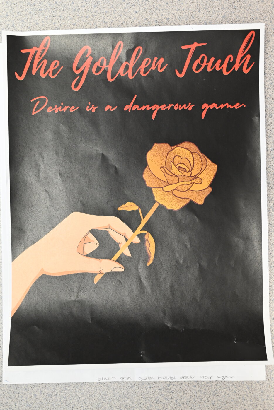
The finished poster makes use of what Butler calls “sensationalizing” in the tagline: adding drama, depth, and suspense to hook the reader in just a few words. The same is true for Emmaline Sprick’s poster of “The Golden Touch,” Hawthorne’s 1851 retelling of the myth of King Midas, a wealthy and powerful ruler whose obsession with gold ultimately destroys his family and his kingdom.
“The hardest part for me was trying to make the story kind of enticing—and also make the words fit together. I used a thesaurus,” says Sprick, “and I searched for a font to tie everything together with an elegant look.” Her tagline, “Desire is a dangerous game,” and the hand holding a delicate yellow rose unmistakably spell elegance and allure.
For Ollie Dias, it was all about the visuals. With a soft, neutral background highlighting a sharply defined human form and a dying flower, his poster for “The Golden Touch” clearly evokes the story’s tragic turn. “You really have to show what you want the viewer to see, so you choose images that stand out—the gold color, and the shape of the person.”
Victoria Rodriguez discovered the power of color and visual hierarchy when she was putting together her poster for “The Necklace,” de Maupassant’s twisting 1884 morality tale about a woman who borrows what she thinks is her wealthy friend’s diamond necklace, only to find out after wearing the accessory to a fancy ball that is was only costume jewelry. Her design features a deep blue background upon which are stacked the story’s title, a glowing necklace, and a grasping hand, followed by the tagline, “Even the brightest things have a dark side.”
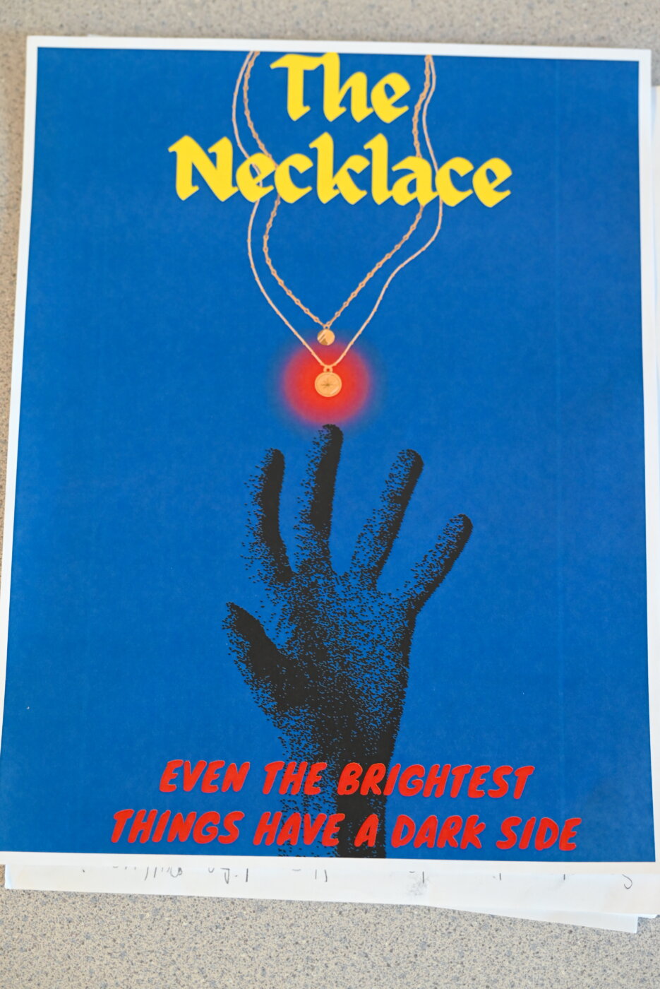
“I really liked learning about how different colors represent different things,” says Rodriguez. “One infographic we looked at said that the first thing people see when they look at something is the colors. Colors really influence what the picture means and what calls out to you from the image.”
What Comes Next?
“The attention and focus from the students during this project were just amazing,” Butler recounts of the ten days’ worth of studying and creating. “Overhearing some of them talking about how they chose just the right words, or admiring someone’s choice of an image, was so fabulous.”
“I couldn’t have attempted a unit like this without help from my colleagues like Meghan—to come up with the research, the grading rubric. She was my teacher, as well.”
When her students asked Butler to apply the same project model to their next read, John Steinbeck’s Of Mice and Men, she steered the Seventh Graders back to their writing. But as Campagna notes, they’re likely to encounter similar innovations soon enough: in science, the students are using Canva for a Health Design Challenge, and later on, in Tenth Grade, they’ll work with Campagna’s colleagues again creating their own infographics about amendments to the U.S. Constitution.
“Laura and I like to put a little ‘a’ in EdTech, the name of our department: EdTeach,” Campagna spells out. “We like to say it’s where technology sort of blends into the background, and you don’t even know that’s what got you to that final product. We often find ourselves showing students and teachers how to use a piece of software, but less frequently do we get to work with them on honing the final result. It’s so satisfying when student engagement and creativity shine through.”